


HOME GARDEN
Moving away from the usual “recipe” of FMCG packaging, we were given a challenge: how do you make a product stand out and give it its own voice in a crowded supermarket aisle, where every single item on the shelf is screaming for your attention?
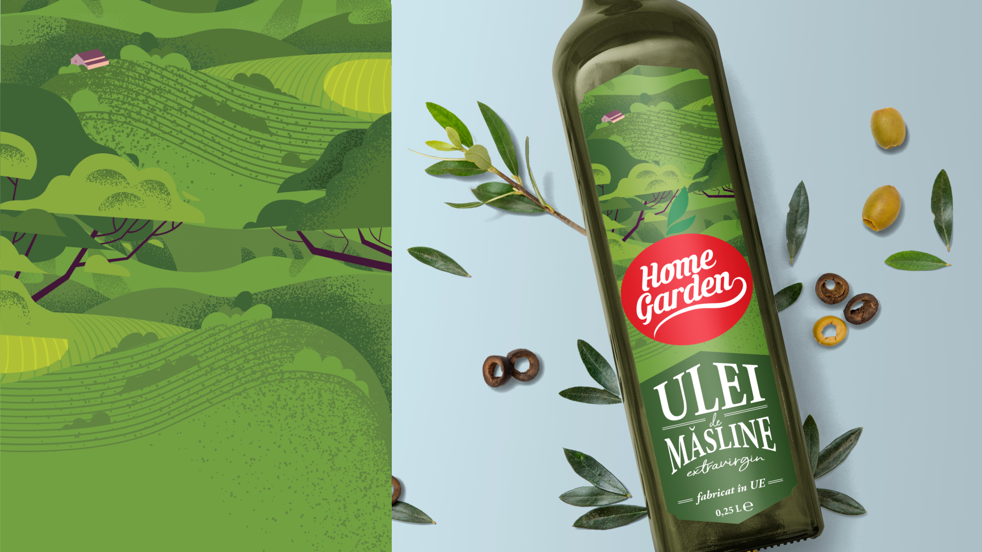
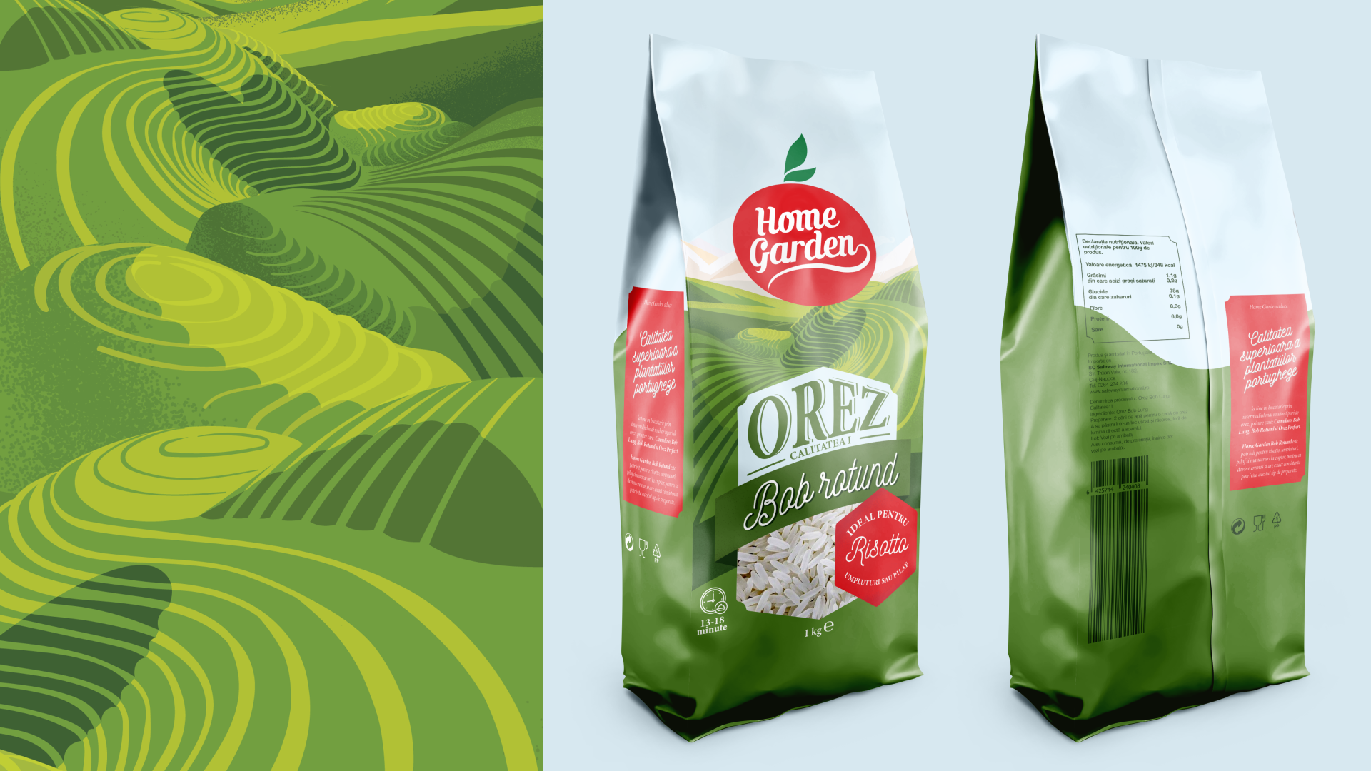
Creating these hand-drawn illustrations, with special attention given to the typography, the products come to life on the shelf with a welcoming and friendly appearance while maintaining their distinct identity created by the focus on the logo and the complementary red and green colour palette.
CLIENT: HOME GARDEN
PROJECT: PACKAGING DESIGN / ILLUSTRATION